PRIMARY LOGO DESIGN - FULL COLOR & ONE COLOR
SECONDARY LOGO DESIGN - FULL COLOR & ONE COLOR
IN THE WILD


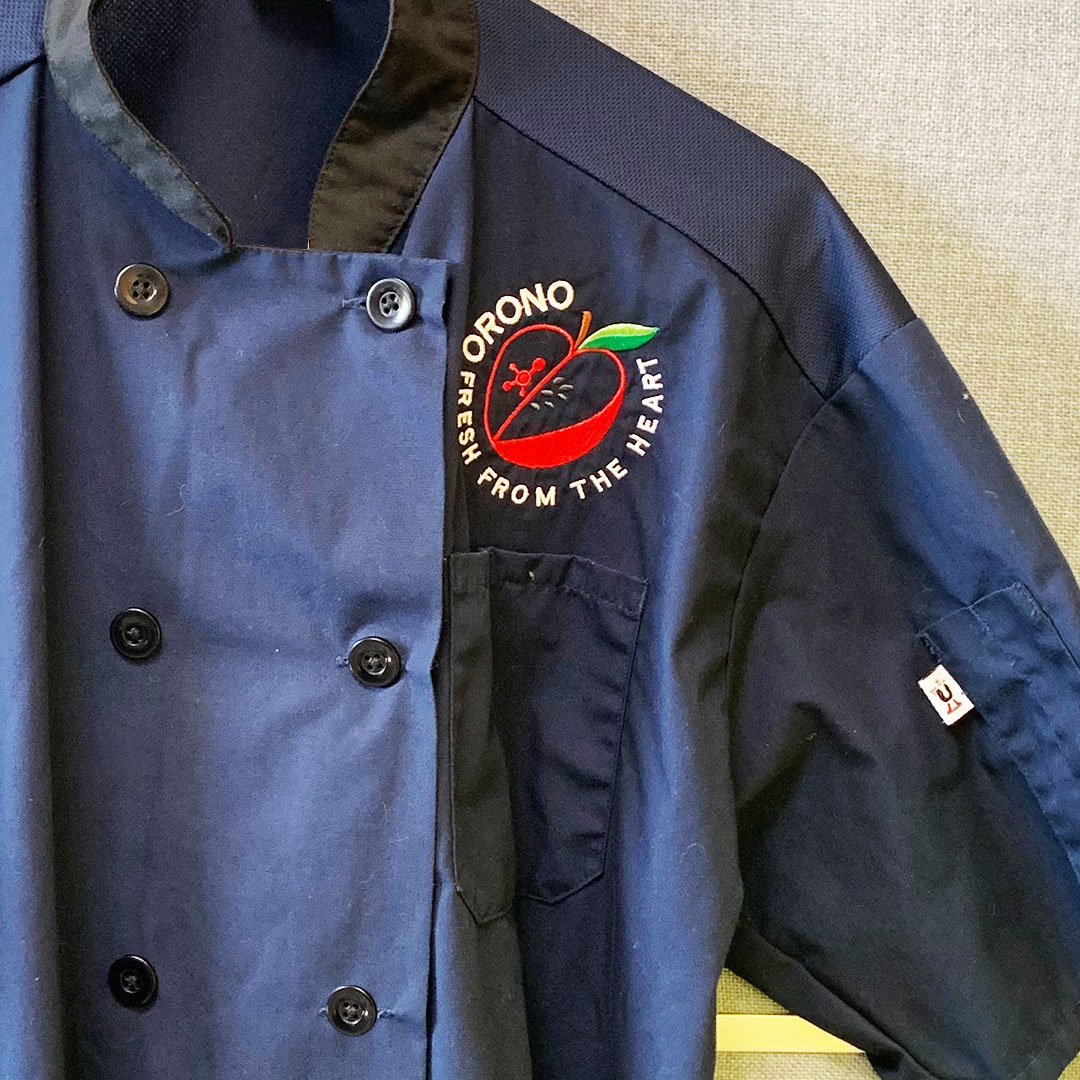
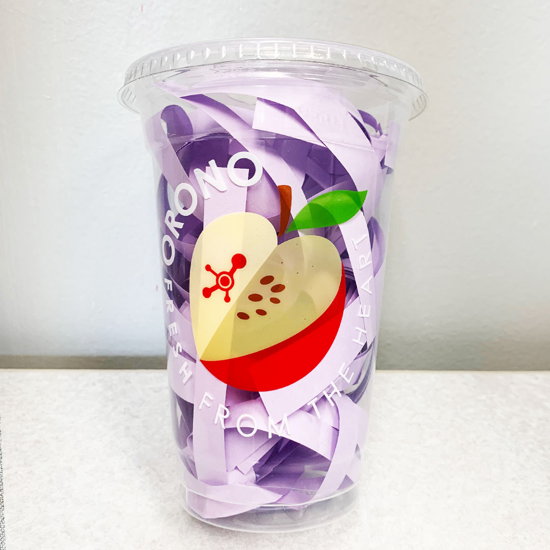
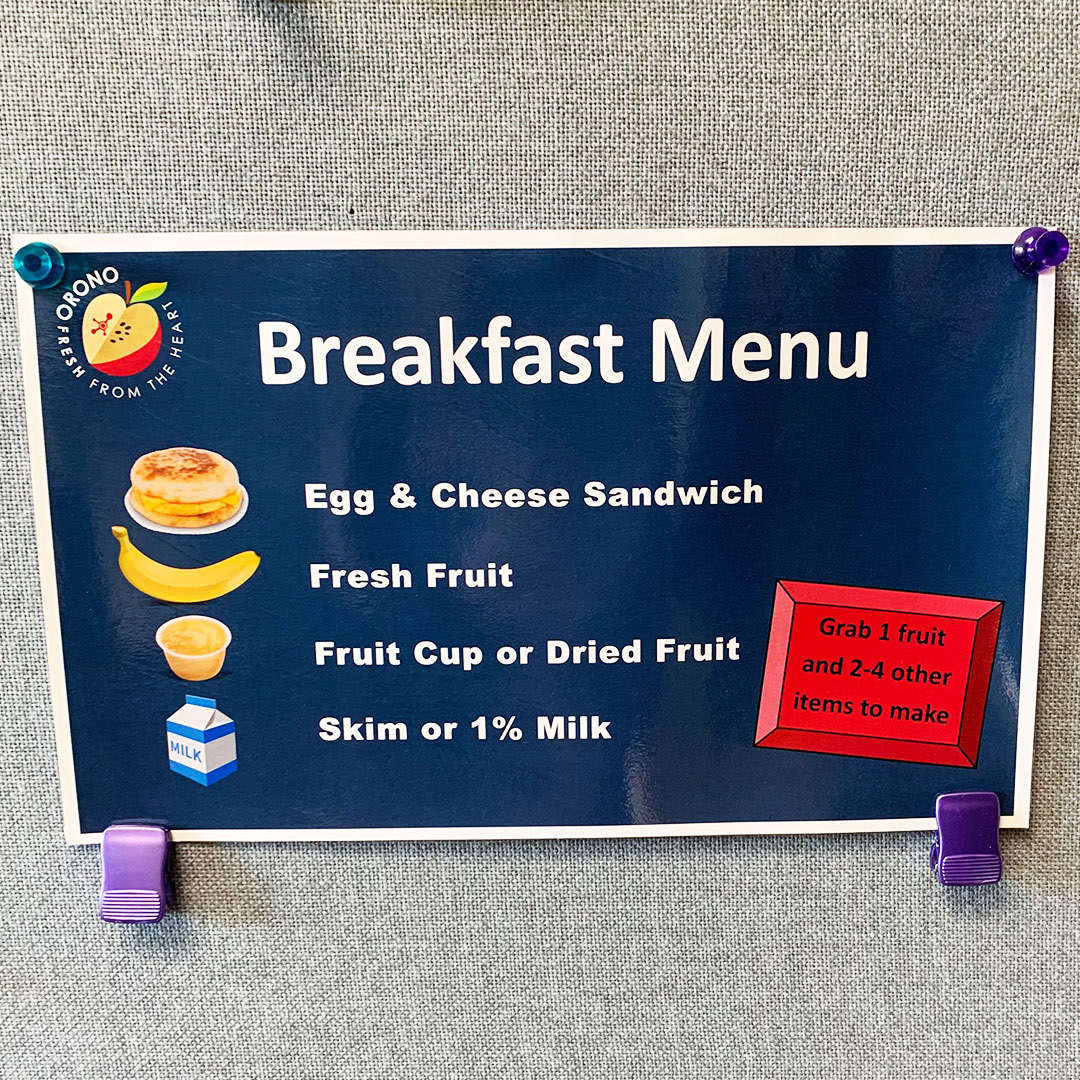
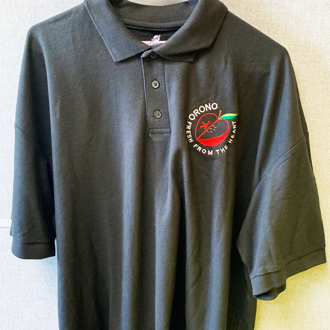
The nutritional services department from ORONO, MN reached out, looking for branding. I worked with them to design a logo mark that could be both versatile in its application but also convey the science and thought that went into all food choices they make. Out of the many design concepts I presented, a few rose to the top and they in the end combined a few ideas together, the ‘apple tree’ spelling out ORONO but then the apple with the molecule seeds in the center of it all became the center of the branding. Nutritional science. It’s where it’s at.
